
I thought about choosing a colour to symbolise 2026 at the beginning of the year, very much like Pantone does with their colour of the year or at least in a similar manner. However, I quickly realised that I couldn’t choose the colour without experiencing the year in the first place and now that half of the year has passed, I wanted to share with you what that colour is in today’s post. As always, if you’re interested – keep on reading!
Au début de l’année, j’ai envisagé de choisir une couleur pour symboliser 2026, un peu à la manière de Pantone avec sa « couleur de l’année ». Cependant, j’ai vite réalisé qu’il m’était impossible de faire ce choix sans avoir d’abord vécu l’année ; maintenant que la moitié s’est écoulée, je tenais à vous dévoiler cette couleur dans l’article d’aujourd’hui. Comme toujours, si le sujet vous intéresse, poursuivez votre lecture !
You might also like:
- How to Create a Colour Palette for your Blog Theme
- Some New Year Resolutions That Are Perfect Throughout The Years
- 3 Meaningful Intentions to Set This Year
THE COLOUR
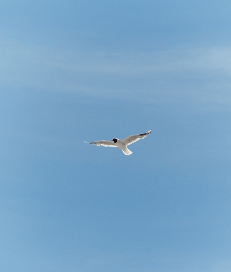
2026 feels like blue to me, not a dark blue, nor a vibrant blue, but the blue which is the colour of the sky. I felt this way at the beginning of the year and I am very much surprised that I still feel the same way in the middle of the year as well.
Related: Flattering Shades For Your Eye Colour
WHY THIS COLOUR?
A lot of times, blue can be interpreted as a symbol of sadness and melancholy hence the reason why it’s used as an adjective to describe one’s emotion or being as depressed, sad or gloomy. In graphic design, blue is associated with trust, safety and calmness, but those terms can be universally applied around the world in different fields and aspects when it comes to this colour as well.
There is an element of serenity and wisdom connected with blue—especially with the sky and ocean—and I think that’s the reason why this year felt very much like a blue to me. It’s the colour of the sky during a sunny day, the colour of the sea when it sparkles, and the colour of all the objects I see throughout the day which make the space feel livelier.
Related: Creating a Colour Palette For Your Branding + Freebies
HOW TO UTILISE IT
I initially didn’t think about writing this post on my blog, it was just going to be a journal entry, but then I realised that this could be something fun to share with and a great way to look back at the previous years in a colourful way. I’ve definitely not bought nor am I planning to buy things in this specific colour to commemorate 2026, haha.
However, I’ve started paying more attention to this colour in my everyday life and admiring the beauty of this colour in terms of architecture, food, nature, jewellery pieces, paintings, etc. It almost feels like a creative game you get play in real life, but it makes you slow down and pay more attention to the world and its beauty.
Related: Sustaining The Joys in Your Life
Thank you so much for reading! – xo N
Connect with me on social media: Instagram | Twitter | Facebook | Pinterest | Bloglovin

